Black and Grey: How I Build a Tattoo From Light and Shadow Alone
Black and grey is where I feel most at home. Strip out colour and nothing is left to hide behind — the whole piece stands on tone, contrast and composition. This is how I think about a black and grey tattoo, from the first idea to the quiet grey that makes it last.
Why I compose before I shade
I never start a black and grey piece from a stock image. Every tattoo begins with your idea, which I develop from scratch into a design with a narrative thread and symbolism, laid out to follow the flow of your body. In black and grey that composition matters even more, because there is no colour to carry the eye — the structure has to do all the work.
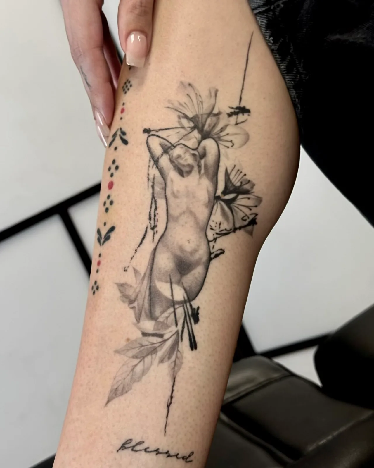
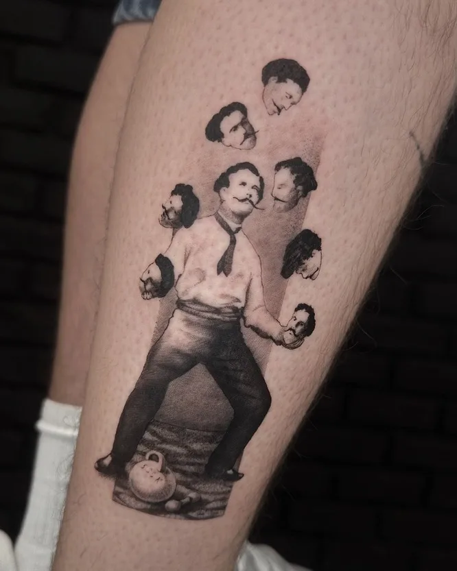
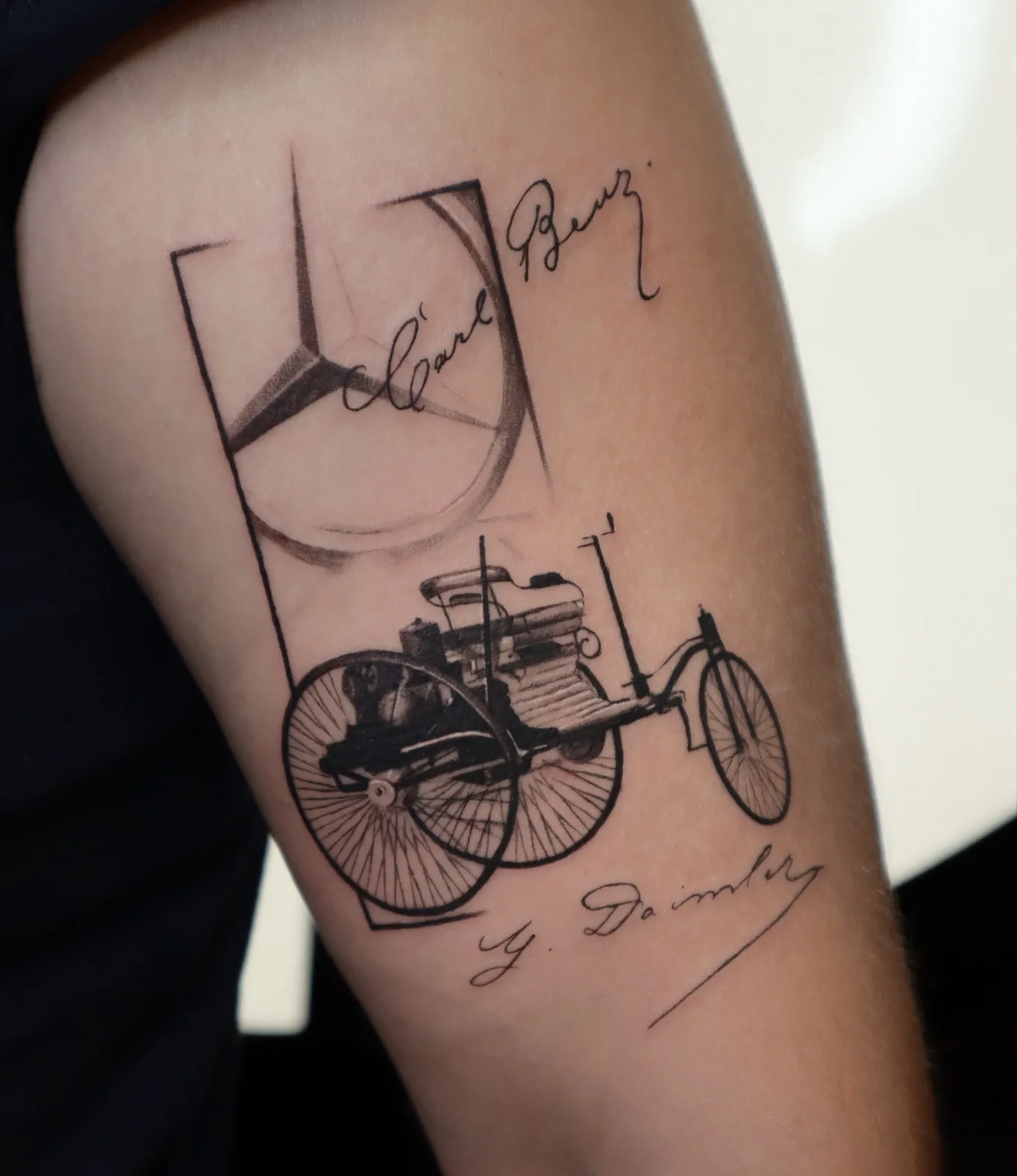
My own style blends realism and illustration, surrealism and collage-like compositions. In practice that means a black and grey piece of mine is rarely a single clean subject floating on skin. It is layered: a realistic focal point, an illustrative passage that editorialises rather than copies, fragments arranged until a single, seemingly inevitable image appears.
Thinking in a full range of greys
The craft of black and grey is tonal. A convincing piece holds a full range — deep, saturated blacks for weight, soft mid-greys for volume, and the untouched skin working as the brightest value in the composition. I treat negative space as load-bearing, as considered as anything I draw; what I leave bare decides how the shaded parts breathe.
My motifs lend themselves to this. The eroded concrete, cracks and forgotten architecture of Bucharest, and the organic patterns I pull from nature — bark, roots, water, erosion — are built from texture and tonal depth rather than colour. Rendered in grey, they read as memory and material: surfaces with a history, not flat decoration.
Built to age well on skin
Black and grey is not only a look I love — it is honest about time. Grey tones settle softly and hold their reading for years, which is why I design for skin that will move and soften rather than for the flat photograph. Contrast is placed where it will survive; fine tonal passages go where the skin stays taut and the light falls cleanly.
This is also why black and grey is often my first answer for a cover-up: deep, controlled shadow can absorb and reorganise an older tattoo in a way colour struggles to. Whether it is a large single-session idea or a piece built over several sittings, the tonal plan is decided before the needle ever touches skin.
A good black and grey tattoo is never just an absence of colour. It is light and shadow doing everything — and when the composition is right, it only gets quieter and better with the years.
Examples from the portfolio